Since the boys have been learning more about programming in Mathematica this summer, I thought it would be fun to review Wolfram’s program again. My older son spent the week looking through the notebook. Tonight we talked about some of the things he thought were interesting.
The first thing that caught his eye was how the average number of interactions per time step affects the spread:
The second thing that caught his attention was how Wolfram was able to model how the virus spread across different kinds of graph networks:
Finally, he thought the “network of networks” model was really interesting and Wolfram’s graph of how the number of connections between the individual networks changed how the infection spread, in particular, caught his eye.
I think that Wolfram’s work here is one of the best examples I’ve seen that makes virus modeling accessible to students. I also really love that there are many different areas to explore further in Wolfram’s work. Definitely interesting for my son to play around with this program a bit more.
One of the most interesting ideas I’ve seen about the spread of the corona virus this week is discussion about the role that superspreaders play. I thought the topic could be made accessible to kids following a plan similar to what we did last week with Christopher Wolfram’s virus spread model:
I also want to be clear that the code we are playing around with here is from Wolfrman’s project which you can find in the link below. Other than really minor modifications for this project, none of the code is mine and this project wouldn’t have been possible without Wolfram’s work:
Today’s project didn’t go nearly as well as I hoped, though, But even with things no going so well I wanted to share the project.
My idea was to show the boys the distributions of outcomes when a virus spreads through a network. So, unlike last week when we just looked at one simulation for each network, today we looked at 1,000 simulations per network. Then, as a really simplified way to look at the idea of superspreaders, we’d look at how the infection spread through the network when the starting point had different numbers of initial infections.
So, we started by looking at one of the networks from last week and talking about the ideas we learned from that project:
Since simulating 1,000 different runs through a network takes a long time I prepared several graphs ahead of times so that we could just talk about the results. Fortunately I prepared two different visuals for each simulation because the first graph I made ended up being extremely confusing for the boys:
We spent a lot of time in the last video making sure that we understood the visualization of the simulations I was running. It turned out that the histogram was the easiest one for the boys to understand.
With the boys hopefully understanding what the histograms meant now, we looked at how the spread of a virus through a network changes as the interaction between nodes of the network changes. What we looked at specifically was how the spread changes from almost nothing to spreading through the entire network quite suddenly.
Having looked at the change in spread based on the average number of interactions in the last two videos, here we changed to looking at how the spread changes based on the number of initial infections. By changing the number of initial infections from 5 to 10 to 15 to 25 to 100 (out of 1,000 nodes) we saw very different spreading patterns in the network.
This way of looking at spread through a network was my guess for an easy way for kids to see / understand the role of superspreaders.
Definitely not my best executed idea ever, but still hopefully something that helped the boys get a bit more understanding of some of the important ideas in virus models.
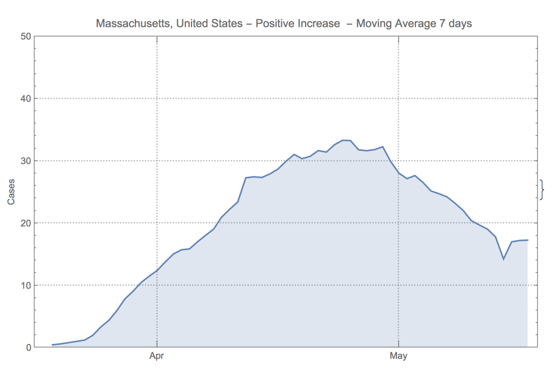
Yesterday I was trying to understand why the corona virus hit Massachusets so differently than it hit Georgia and Diego Zviovich shared a really nice bit of Mathematica code with me:
In case the graphs don’t so up show well from Twitter, here are the graphs of new positive cases in Massachusetts and Georgia since March (per 100,000 population)
Zviovich’s code was so easy to use that I made a gif of the charts for all states and territories. It wasn’t working well with WordPress, but you can see it on twitter here:
I used some Mathematica code that @dzviovich shared yesterday to make a state by state (and territory) graph of corona virus cases by day (per 100,000 population). It is wild how different the outbreak has been in different states in the US. pic.twitter.com/eEF3Nut21Z
Tonight I asked me kids to look at the graphs from the different states and territories and pick out 4 that caught their eye.
My older son picked out Washington D.C., Louisiana, Nebraska, and South Dakota
My younger son picked out Kansas, Nebraska, New Jersey, and South Dakota
I thought this was a nice exercise for kids. Both to see how you can use computer programs to sift through lots of data, and also to see how to read and interpret graphs.
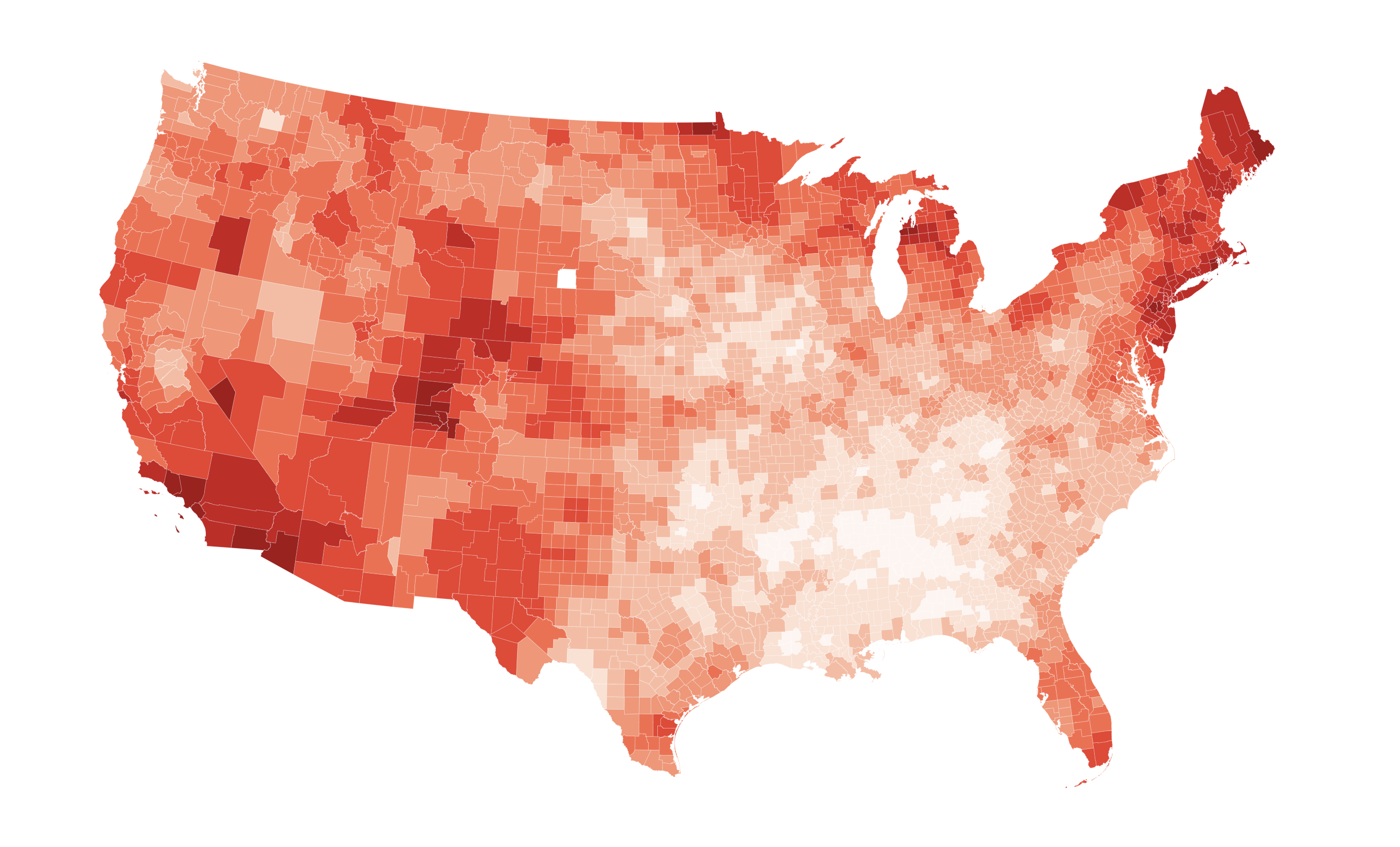
My younger son had thought it would be neat to see how the map looked scaled by population, so I spent a little bit of time trying to figure out how to do that. I’m a total novice when it comes to using Mathematica, but I was able to figure out how to make the new presentation for my son last night.
We started our project today by looking at the original map that Bahrami made:
Next we took a look at Bahrami’s code. The goal here wasn’t to understand the details, but rather to see that making a visualization like this in Mathematica is actually not nearly as hard as it seems . . . if you know what you are doing!
Finally, we took a look at Bahrami’s map scaled by county population. I didn’t do as good a job with the colors as I should have – the darkest colors are 3 cases per 1,000 people in the county. Still, it was interesting to hear what the boys thought of this map vs the original one.
Even though fully understanding the underlying code is a but much to ask for kids in a 30 min project, I think Mads Bahrami’s project is a great one for kids to see. It give kids a chance to see how data visualizations are done, and also gives them an opportunity to understand and talk about the data. I really like sharing this project with my kids.
I’d played around with it a bit over the last two days and decided to share some of the ideas with my kids this morning.
We started with the basic idea of networks and graphs:
Now we stepped away from Wolfram’s mode for a second to look at several of the different kinds of graph structures he was studying. The boys had some pretty interesting things to say about the different types of graphs:
Next we looked at one of the results in Wolfram’s project that I thought was particularly fascinating – how a seemingly small change in assumptions can cause a virus to change from hardly spreading at all to spreading across the entire network:
Finally, my older son (in 10th grade) had looked through Wolfram’s presentation yesterday and I asked him to show some of the ideas that had caught his eye:
I love Wolfram’s post – both for showing how mathematical modeling can showing you interesting ideas about the spread of a virus and for showing the power of Mathematica to make these models accessible to everyone. This was a really fun project to share with the boys.
As I was trying to decide on a math project for the boys this morning I saw Steven Strogatz tweet out a fascinating set of graphs:
Some surprises here on which US States are flattening or crushing their curves — and which are not. Also, very clear graphics and answers to FAQs. https://t.co/JHy71IFL3shttps://t.co/Lv8YhMp6yY
Clicking on the link gave me the idea to look (and re-look) at some of the corona virus models and graphs. It is always fascinating to see what kids take away from graphs / models and I think it is important for kids to learn how to think about and interpreted graphs like these.
So, we started today’s project by looking at the graphs from EndCoronavirus.org
Next we revisited some of the maps and models that we’d looked at roughly 6 weeks ago just as the lock downs were starting. Here’s that old project:
Part of the idea here is to show kids that the corona virus really doesn’t show up when you are looking for the flu:
Next we looked at the Kinsa Health Weather map – this is a map made from internet connected thermometers. It was also designed with measuring the flu in mind. Here’s a link to that map -> https://healthweather.us/
Now we looked at a map that tracks movement using cell phone data. That map is here:
From this map we see that movement in the US is starting to move up. Roughly speaking it had been down about 50% and is now down closer to 25% from normal in the states we looked at:
Finally, we looked at the IHME model and projections. That model is here:
There’s been a lot of laughing / crying about cubic models in the last few days, but I thought talking about modeling could make a nice lesson for my son who is reviewing calculus. Then I saw a great tweet from Carl Bergstrom that made me want to give it a go.
First we talked about cubic polynomials in general and what we can learn about these curves from calculus:
Next we talked about fitting a cubic polynomial to data. We have talked a bit about fitting curves before – my son mentioned this project on fitting temperature data which used some amazing work from John Shonder on looking at temperature changes in each US county for the last 100 years:
In this video I asked him for his ideas about why fitting data with a cubic curve might lead to problems:
Next we moved on to looking at the cubic model that was published and focused a bit on the fascinating tweet below from Carl Bergstrom. I think Bergstrom’s tweet is a great lesson for calculus students because he’s noticing that the “cubic fit” can’t be a 3rd degree polynomial because the 2nd derivative isn’t right:
So if it's a third degree polynomial fit, how they get a + / – / + pattern of second derivatives?
Magic marker?
(Not being sarcastic; the dotted part of the pink line might just be hand-drawn)
Finally, we looked at a few cubic and log-cubic fits to corona virus deaths in the US. I showed him that forcing a cubic fit to the data ended up with some strange results. Finally, I asked him why those strange results might be coming from the cubic fit (which is a pretty hard question for a 10th grader):
This was a nice project – and an especially nice one to show a calculus example directly related to current events.
This morning I saw a nice twitter thread about herd immunity from Tim Gowers. In that thread I learned about a NYT opinion article written by Carl Bergstrom and Natalie Dean. Here’s Gowers’s twitter thread which has a link to the article:
A thread to explain point 1) in more detail. (A similar explanation is in the v.g. article by Natalie Dean and Carl Bergstrom that is linked to — the one I give below is not importantly different, but is slightly more mathematical than would be appropriate for the NYT.) 1/ https://t.co/NZynuyrTtM
I thought that both the article and the twitter thread would be interesting reads for the boys this morning. We started with the article – here are a few things they found interesting:
[before diving in – our regular camera stopped working, so I filed this project with my phone. Sorry that the film quality is poor]
After talking about the article a bit, we dove into exponential growth. I think they’d understood the exponential growth ideas in the article at a high level, but going a little deeper really did help them understand the ideas about growth rates better. It was particularly interesting to hear them talk about what happens when 1 person infects 1.5 other people on average:
Next I had them read through Tim Gowers’s twitter thread (while I learned how to download videos from my phone to iMovie 🙂 ). They looked at the thread for about 10 min – here are their initial thoughts:
Finally, we took a close look at the infinite series that Gowers used in his twitter thread. My older son was already pretty familiar with infinite geometric series, but my younger son is not as used to them. Here we talked through the ideas behind the general formula for the sum. My younger son had some good ideas for how to sum the series, so this turned out to be a really worthwhile discussion:
This project was really fun. I’m glad that so many scientists and mathematicians are sharing their ideas with the public. I’m especially thankful for ideas that are presented so clearly that they can be understood by middle and high school kids.
Last week Grant Sanderson published a fantastic video showing some simple models of how a virus can spread through a population.
All of the common pandemic models are pretty complex and have tremendous uncertainty in their parameters, but Grant’s video does an incredible job of showing their strengths and weaknesses.
Today I watched the video again, but this time with my kids. I asked them to take some notes and then we talked about what they thought was interesting. It is always fascinating to hear what kids take away from math / science content.
Here’s what my younger son (in 8th grade) had to say:
Here’s what my older son (in 10th grade) had to say:
With so much terrible news about the corona virus lately, I thought it would be good to talk through some of the numbers and models with them. One thing I thought would be particularly interesting for them to see is why the virus didn’t show up on some of the flu tracking maps, yet.
We started by looking at some of the flu maps from the CDC so they could see how those maps work. Those maps are here:
Next we moved to this interesting flu tracking map which uses internet connected thermometers. The interesting thing about this map is that it indicates that the flu-like systems are declining rapidly right now:
Here’s what they boys had to say looking at Miami, New York, and Boston on this map:
The next chart we looked at tracked movement in the US using cell phone data. This map allows us to see how the lock downs around the US are working. The map is here: